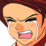
I love them - especially the meta world ones!
I actually loved the whole charm of Umineko, the backgrounds definitely added to that. But also the original sprites, and the music itself. Combining them together, there was a kind of very nice charm to them.
It’s hard to explain.
Higurashi’s original backgrounds and art, even music at times, felt very like, for example (to me personally!) kind of like trying very hard to mimic typical dating sims or visual novels at the time - especially the horror type at some parts, and the dating sim time at other parts. I think for me with the backgrounds of Higurashi, seeing the familiar type of Japanese landscape scenes was more a callback to the usual visual novel, that left some of it’s charm lost.
I can’t blame Ryukishi since Higurashi was a new endeavor and it’s better to stick to the norms and play it safe than trying to go beyond that initially. And indeed I believe for a majority it was preferred, since Higurashi remains to be more popular than Umineko ;; for myself personally however I prefer deviations from the norms, and Umineko fit that shoe much more comfortably for me.
In Umineko, I feel the background style worked better for me because it fit more into a kind of Victorian or older time charm. In old Victorian art things tended to be similar as such in a kind of “sketched” or perhaps more watercoloured-like format like the backgrounds are in Umineko. It also adds to a kind of fairytale charm of the images since the style is also more suited to those backgrounds.
The music added to this charm (much more “solid” and “unique” to me than Higurashi’s music, especially with binaural/atompsheric type tracks, or the classical tracks. Which fit the scenes either in the meta or Rokkenjima mansion very well - I like to joke Umineko music was the progenitor of Witch House music, considering some of the meta battle themes like Liberated Liberator, or Golden Slaughterer )
The sprites themselves were a big contrast to these two charms, but I could handle the art much better since the proportions were less moe style (in comparison to Higurashi) and oh, the costumes, especially the costumes tying into the Westernized aesthetic moreso than a usual Japanese family tied everything in perfectly. Instead of simply a modern Western dress, we have Natsuhi, for example, in full late Victorian dress. Eva as well, while not having a kind of Victorian dress, it still brings to mind an old-style early 1900s murder mystery aesthetic where a character may be wearing a more “foreign” style dress, like Eva’s cheongsam style. (especially because the popularized cheongsam itself is from the 1920s, and not tied to any ancient style)
I feel like the style of the sprites (and their clothing) tied in the whole charm of the backgrounds. Everything was woven together perfectly to me to fit into nicely as that kind of “Agatha Christie” or older early 1900s murder mystery aesthetic. The watercolour-like/sketched backgrounds also fit into this well, and it was unique in comparison to how it felt when this style was done on Japanese backgrounds or landscapes, like as it is in Higurashi. Which I really appreciated and loved.
 Ryukishi art, and the backgrounds for Higurashi, Umineko and Higanbana are really nice. In Umineko my favourite original backgrounds are the garden ones. Ironically they ended up being the ones which suffered the most in PS3 version.
